The Fonts I have known and loved (or hated).

Knowledge of fonts used to be purely the preserve of designers and artists, but with the ubiquity of computers most people brush with font choice regularly. To the average person most fonts look more or less the same but designers are trained to work with fonts and notice the subtle differences that will make one font be better suited than another. Designers will also have their favourite ‘go to’ fonts, as well as ones that would be best avoided at all costs.
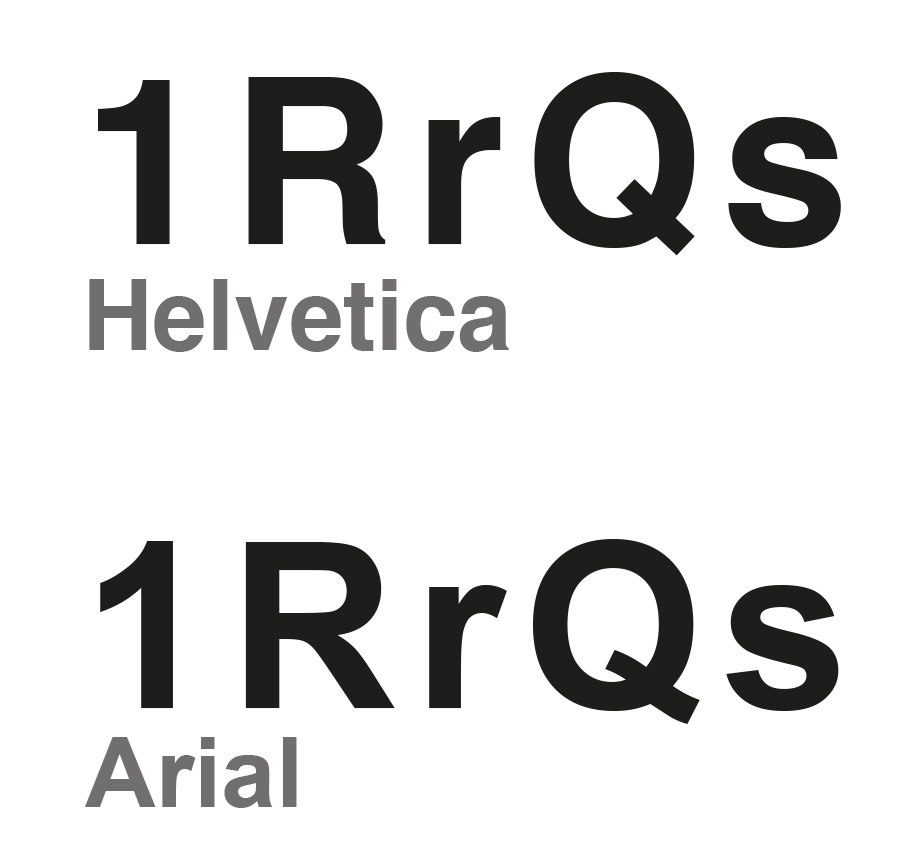
Ever since I embarked on my career in design in the 1980’s, there’s been one font that has always been in great favour, and that’s Helvetica. A ‘Sans Serif’ typeface (which means that it doesn’t have the little lines and lips at the top and bottom of letters) developed in 1957 by Swiss typeface designer Max Miedinger with Eduard Hoffmann it has since become one of the most popular fonts of the 20th century and is still going very strong in the 21st. There’s something about the way the font has been designed, with it’s equally balanced letters and neat, presentable form which means that nearly anything set it in will have a certain gravitas and style. Just look at the huge list of blue-chip companies that use it as their logo typestyle: BMW, Kawasaki, Lufthansa, Nestlé, Panasonic, Epson and Texaco to name but a few. Until recently Apple used Helvetica as the typeface of iOS. It is also of course the brand typeface for us here at Pelican!
Helvetica is very clear and easy to read whilst also being authoritative, which is probably why it’s commonly used by the UK and other governments to communicate with the masses. NASA also used the typeface on it’s Space Shuttles. Sadly I read that the designer who designed helvetica did it for a flat fee receiving no royalties and died virtually penniless. It seems there doesn’t seem to be much money in designing typefaces. If a font that is designed is any good, it’s immediately open to copying, with legal protection for font creations being quite hard to enforce.
In my view, the Arial font is Helvetica’s poor cousin. Arial was created in 1982 to be metrically identical to Helvetica, with all character widths identical, so that a document designed in Helvetica could be displayed and printed correctly without having to pay for a Helvetica license. In 1992 Microsoft adopted Arial to be one of the four core True Type fonts in Windows 3.1, announcing the font as an ‘alternative to Helvetica’ , and since Arial has become very widely used in businesses and organisations everywhere.
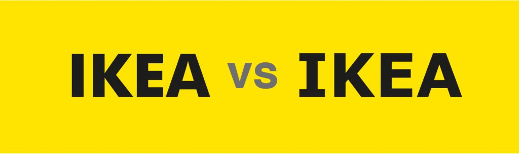
Fonts may be below the radar to most people but they can suddenly matter when a company changes their font. There was an uproar when Ikea changed their font from Futura to Verdana in 2009, as there was when Google changed their font from a serif font to a sans serif font in 2015. It seems these small tweaks to things very familiar can unsettle some people.
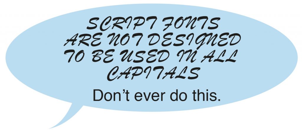
Brush script was designed in 1942 by Robert E. Smith. It’s designed to emulate the look of handwritten letters in an ink brush. It was very popular in the 1950’s it became less popular in the 1960s as preference for clean lines and legibility came in (The era of Helvetica!). It’s a font that can look truly awful if overused or not used correctly. A big no-no is using it all in capitals and I remember seeing car numberplates rendered in Brush Script which looked truly awful. This practice was pleasingly outlawed in 2001 when strict new rules came in about the use of lettering on numberpates in the UK. It was used as the font for the Australian soap opera Neighbours until 2007. The problem with script fonts, and there are many better than Brush Script, is that they are trying to fool you into thinking that the type has not been set on a computer, and they all ultimately fail at this.
The font Trajan takes it’s name from the Roman Emperor Trajan as it is based on the Roman square capital letterforms found on ‘Trajan’s Column’ in Rome. A very elegant typeface, it has recently suffered a little from overuse on film posters.
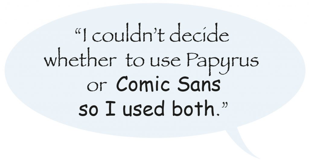
Another font that designers love to hate is Papyrus. Developed by hand with a calligraphy pen and textured paper in 1982 for Letraset, It has a causal and vintage look which is very popular for use in church powerpoint presentations. To this day I am proud to say in my 29 year career I have never set anything in Papyrus (apart from using it to illustrate this article!). Whist on the subject of powerpoint, we could move on to Comic Sans. Released in 1994 by the Microsoft corporation, and supplied with Microsoft Windows since their ’95 version, it was originally based on the lettering style found in comic books. It’s very informal style has meant that its use can seem highly inappropriate in certain situations. Anyone thinking of setting their CV in comic sans might be advised to think again. The general dislike of these two fonts have led Graphic Designer Ben Harman to create Comic Papyrus, which is a combination of the two fonts. Papyrus was even used for the film Avatar, it was a tweaked version that appeared on the posters but the standard version appeared on the credits and for the subtitles of the alien’s conversations.
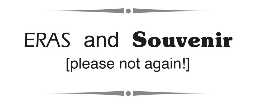
In my experience, even the worst fonts have their place, they just have to be used in the right context and the right way. American Typewriter is (I think) an awful font but worked for use on the “I heart NY” logo in the 70’s . What irks me is lazy typography, when people just choose the easy option without seriously considering a font that could really make something stand out and be unique. Also, fonts go in and out of fashion. In the 1980s, the font Eras was the height of fashion. With today’s eye, text set in it to me looks dated and awful and it’s one of my pet hates, although I have still come across it in more recent times. I think to myself “please no, don’t let this one come back into fashion again!”. Fonts do come in and out of fashion. Souvenir, the ‘comic sans’ of it’s day (which I remember pasting up reams of by hand in the 1980’s for magazines), has apparently started making it’s way back on to the pages of some design magazines. God help us all.
In the 1990’s the studio I worked in had a printer that would substitute the font Courier for any font that wasn’t installed properly. Courier is a font that is perennially ugly and is based on the font of a typewriter in a ‘monospace’ style in which all characters are the same width. This makes it more difficult to read. Maybe it’s my association with something that is incorrect but in my opinion there is no excuse for using Courier anywhere. Sometimes typography can even produce emotions as raw as anger. The font created for the London 2012 olympics, like the logo, makes me angry. It’s only saving grace is that it’s very recognisable, which also makes it very hard to forget, given that this was nearly 5 years ago and I’m still scarred by it!
There has been much debate and many studies as to whether a ‘Serif’ font or ‘Sans Serif’ Font is easier to read, and it turns out that it’s a non issue – research has shown that there is no difference – any well designed and well presented font will be easy to read. Research into the readability of road signs reveals that lower case letters are easier to read at high speed. It shouldn’t come as any surprise that text set in all capitals is slightly harder to read, as it also represents ‘shouting’ in texts and emails! Designers know that setting vast areas of body copy in all capitals is a no-no, and capitals should only be used sparingly in other areas.
However, when it comes to presenting information that needs to be absorbed, maybe us designers should put aside our prejudice about ‘ugly’ fonts. A 2010 Princeton University study involving presenting students with text in a font slightly more difficult to read found that they consistently retained more information from material displayed in ugly fonts such as Monotype Corsiva, Haettenschweiler, or Comic Sans Italicised were used) than in a simple, more readable font such as Arial. There is also an argument for using a more fancy or complicated font for selling a costly product as describing it in a hard to read font apparently suggests to the viewer that more effort went into creating it.
In my opinion, if something looks nice, is readable and well presented and works then the choice
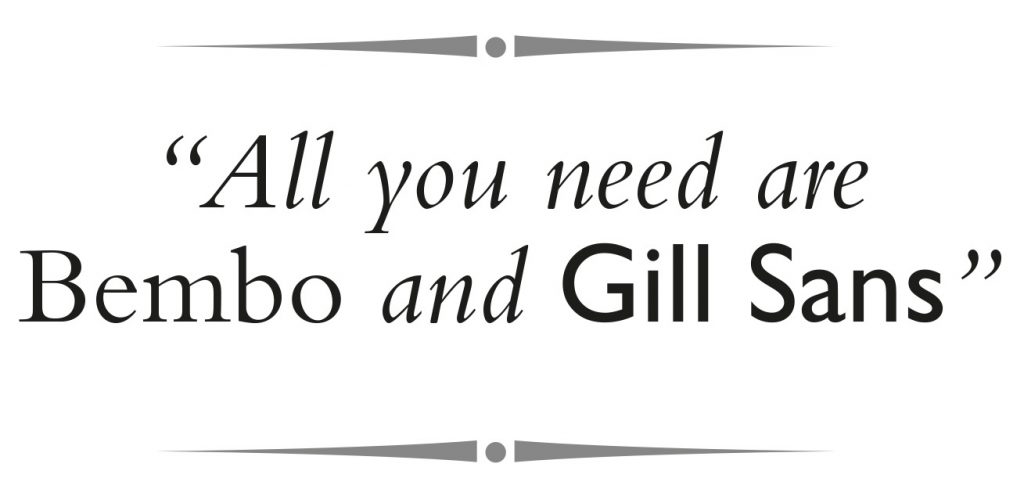
of font is largely irrelevant. A talented design colleague I once worked with insisted that you only needed two fonts, Bembo and Gill Sans. Maybe there’s some truth in designers keeping their font ‘palettes’ quite limited – the talent comes in the layout, design, colours and the way the fonts are used. Whatever the future holds in the world of fonts, I’m sure we can expect some excellent typographical examples as well as some horrendous font disasters.
Further reading….
For an interesting browse into the different fonts used for different industries then the site www.fontsinsue.com is well worth a look.
Leave a Reply